Gradebook Overview
Target Audience: Teachers (Buzz Platform)
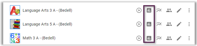
This article provides an overview of features found in the Buzz Gradebook. To access a course gradebook, select the Gradebook icon (bar graph) associated with the desired course from the Teacher App homepage.
Gradebook Environment
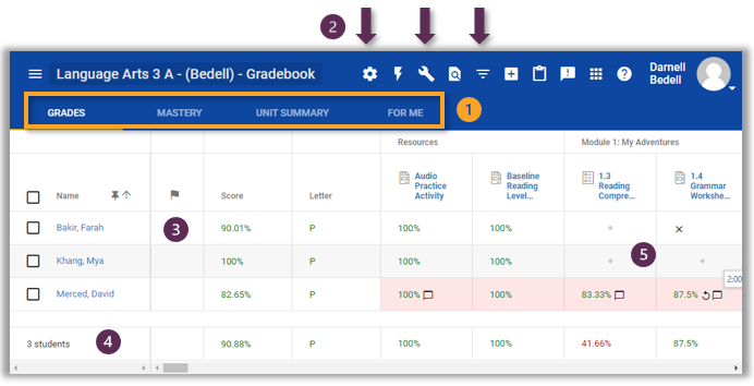
(1) Gradebook Tabs
The gradebook contains four tabs.
Grades tab – This is the primary spreadsheet view. Although most grading occurs from the Needs Grading widget, teachers can also grade directly from the gradebook. Drill down on the paper icon or grade view to review or grade. Select a student’s hyperlinked name to view the student’s view of Grades.
Mastery tab – Will only show data in Language Arts and Math courses that are preloaded with standards mapped. The first level view is a summary of class performance. Drill down on a standard to view student-specific performance.
Unit Summary tab – Shows students’ completion within given modules.
For Me tab – Displays My Choice assignments as well as assignments assigned via the Clipboard.
(2) Commonly Used Navbar Icons
Many navbar icons are visible across different views within Buzz. The following are the most commonly used icons when viewing the gradebook.
Gear Icon – Select to change display options. It is also possible to share your preferred display options across all courses. Review and consider adding footers or other data to your default gradebook view. One common desire is to add due dates within the footer; however, this is only possible if the course is a Range course where teachers assign due dates to the class. No due dates will display if you have a Continuous course that individualizes due dates. If your course is set as continuous, drill down on the student’s name to view their individualized due dates.
Wrench Icon – Select to export gradebook or finalize grades.
Inverted Triangle Icon – Select to open filter options. Teachers can filter the gradebook by category, groups (if created), modules, or student names. Always remember to clear filters when done viewing.
Additional gradebook navbar icons:
Lightning Bolt Icon – Select to override grade or enter grade without opening the assignment.
Search Icon – Use to locate a given activity.
(3) Accommodation Flag
This column contains a flag if school administrators add IEP/504 documentation or allow for fewer multiple-choice distractors or the removal of auto zeros if this feature is enabled. Drill down on the flag to view specific accommodations.
(4) Footer
By default, the footer displays the class average on all assignments. To add items to the footer, select the navbar gear icon.
(5) Grade Region
Column Title – Select the activity name to access bulk grading, exemptions, and assignment analytics.
X Con – Represents an assignment that was exempted for the individual student.
Dot Icon – Represents an activity hidden from a group. Groups are generally used to adjust content views for late starters or students with accommodation needs.
Comment Bubble – Indicates teacher feedback was posted for the student. Drill down on the grade to view.
Circular Icon – Indicates a student was allowed an additional attempt on top of the default max attempt. Do not allow retries on assignments where zeros were automatically added for late work. Do allow retries on any assignment where you as the teacher entered a grade.
Paper Icon – A submission that requires teacher grading has been submitted. These activities should also display in the Need’s Grading widget.
Grades – By default all grades display as percentages. To change the grade display to points or letter grades, that change must be made in the course settings » change the type of display associated with each grading category. Drill down on a grade to view submission(s) or add comments.